Home
Home
 Korean

Logo
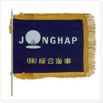
Jonghap we put a symbol in word itself that it is English "JONGHAP" of the show's the pride of the company. Symbol using the "O" in the alphabet in that, it symbolizes the Earth is the foundation of life, on the strong outpouring of prosperity along with the sun light, and of the accomplish the prosperity that the Jonghap Maritiem, all means jump with the advanced technology and first-class company.
Symbol
Grid
Logotype


Signature


Color
- RGB
- : R0 / G114 / B188
- CMYK
- : C100 / M50 / Y0 / K0
- RGB
- : R99 / G100 / B102
- CMYK
- : C61 / M52 / Y50 / K21
History of logo change
1974.7.5 ~ 1979.3.12
Embodied the "M" character originated from English of Jonghap ; Consolidated Maritime Service Inc. Symbolizing bow shape of the ship pursue the professional repairing service company , heading strongly to the world.
1979.3.13 ~ 1996.2.28
Logo represents that a company that the English of the Jonhap Consolidated Maritime Service compounding vessel related to "M" shape of General Maritime Service (Maritime)
1996.3.1 ~
Jonghap we put a symbol in word itself that it is English "JONGHAP" of the show's the pride of the company. Symbol using the "O" in the alphabet in that, it symbolizes the Earth is the foundation of life, on the strong outpouring of prosperity along with the sun light, and of the accomplish the prosperity that the Jonghap Maritiem, all means jump with the advanced technology and first-class company.